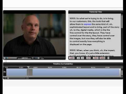
This is a devastating Adobe technology. I dub it "SmartSpeak"
If you've ever edited any interview, you're plagued with the 'ums' and 'likes' and other linking words. (If you have short attention spans, skip my text, watch the video and then come back here.)
Somewhere, thankfully forgotten to history, when I was in film school I did a series of interviews where all I did was cut the linking words together. Funny (wish I had a copy to show right now.)
Any way you cut it (pun intended), it's the biggest struggle in construction of documentary/corporate productions - getting concise sound bites created from people who aren't professional speakers.
You end up with a Franken-edit - where you've glued sections together (often out of order, often slugging a word from a different spot to replace a work that didn't inflect that you way you needed) and you prayed that you had a good 3-4 opening seconds for a lower third, knowing you'd cover up the edits with B roll.
Adobe funds quite a bit of speculative technology. They make smart bets and acquisitions, some that might take years to take fruit.
Adobe - don't take years on this. This is as groundbreaking as content aware replace/removal was to Photoshop users.
I'm going to call it "SmartSpeak" because it'll remove linking words making people sound smarter. I also like SmartBite.
From John Nack's Blog:
Adobe’s Wil Li plus UC Berkeley-based collaborators Maneesh Agrawala and Floraine Berthouzoz have unveiled “a one-click method for seamlessly removing ’ums’ and repeated words, as well as inserting natural-looking pauses to emphasize semantic content.”
Advanced Media Composer tips
Tip sessions are my favorite. They're unique, custom to the room - based on everyone's needs. My favorite saying is:
“I want to show you something so cool it makes you cry”
...and then find a dozen or so things to make each person in the room cry.
But there're no notes from sessions like this because it's so custom. If you have a question about something I did during the session, feel free to ask me in the comments or email me.
Advanced Adobe Premiere Pro tips
I love tips sessions - they're always about 'Can I find something really new and powerful that this group doesn't know.' And my goal always is to find at least five items for every person in the room.
Since Tips sessions are custom to the room - there are no notes; if you look at your notes and have questions email them or leave them in the comments.
The rule is cool/quick/smart about which items I pick. Sure, it might be nice to have insight to the how/why of setting up Adobe Premiere Pro sequences - but that's really a blog post. For example, it's about the idea that you can render faster if someone shows you how to create previews at half resolution.
The problem with tip sessions is tips one the one above (which I didn't show) is unique to the crowd. I usually come in with a dozen or so cool tips and let the crowd tell me where they're frustrated/lost with the software.
I didn't do the above tip during the session, so I wrote it out below.
If you create a sequence preview and switch it's editing mode to custom, you can halve the vertical and horizontal resolutions of your previews in Adobe Premiere Pro. This is only useful if you export Media at the default setting (use previews off.) If you turn this on, you'll screw up your exports. Keep "Use Previews" off if you want to use this technique.
Take your Preview size and set it to half - so 1920 becomes 960, 1080 becomes 540 - 960x540. If you're working in 720, that's 640x360.
Since we're calculating only 1/4 of the area - your previews will be 4x faster in Adobe Premiere Pro - and this tip works (at least) all the way back from version 5.
“This tip will quadruple the speed of your previews in Adobe Premiere Pro”
Practical Video Compression in a Post YouTube World
It's one of my favorite sessions to present. It's a dark area with loads of misinformation. Every time I teach this, something is better in the presentation.
Advanced Color Correction in Media Composer
Color correction is a deep art at the end of the Post Production Chain. In this class, we focused on getting everyone capable of reading scopes, using the auto corrects, but most important, understanding the order of control use and the why behind it.
This is the Symphony Color Correction window.
Mastering the Magnetic Timeline in FCPX
FCPX reinvented the way we edit - either you hate it or are willing to embrace it. This session covered some of features of base editorial - where it's nearly impossible to go out of sync and you have to rethink the concept of 'tracks.'
I didn't get to cover some of the deeper topics here (such as trimming), but they're in my notes - feel free to ask questions if you have any!
BCC - The Best Effects you're not using
Boris Continuum Complete are installed on nearly every pre version 6 Avid. These effects came bundled with the tools.
Except most people don't know them and don't know the little tricks to get them to solve all sorts of problems in Media Composers compositing model - for example, you don't alt drag a boris effect onto a title.
Of course, I couldn't cover all the effects, but I did cover how to decode the effects and get new and current users over a number of little stumbling blocks.
PDF of notes from the session.
Advanced Compression with Avid and Squeeze
Sorenson Squeeze comes with your Avid. It's crucial that you understand how to get your materials from your Avid (beyond just the send to template). We also discussed the basics of compression, how to get better looking YouTube videos, the CUDA acceleration in Squeeze and 360 Sorenson where you can host some content for free.
Script Sync and Phrase Find
These two technologies from Avid have ruined me as an editor. Once you use them, you'll never want to try editorial any other way.
Scriptsync
Scriptsync syncs takes to a script (fantastic for narrative/script based editorial) or to a transcript (fantastic for documentary based.)
Phrasefind indexes spoken words.
Digital Cinema Camera Workflows in Avid Media Composer
First Session at the LA Post Conference.
Had a great time with Michael Kammes of Keycode Media. Seriously, go check out his Web site for all sorts of fantastic technical knowledge.
Here is the PDF of the keynote presentation we showed.
Two quick videos:
One from Bob Russo (a fantastic guy from Avid) on XDCAM workflows
The second from Alex Walker on DSLR Workflows
101 apps removed!
New iPhone is on the way...so it's time to start cleaning up.
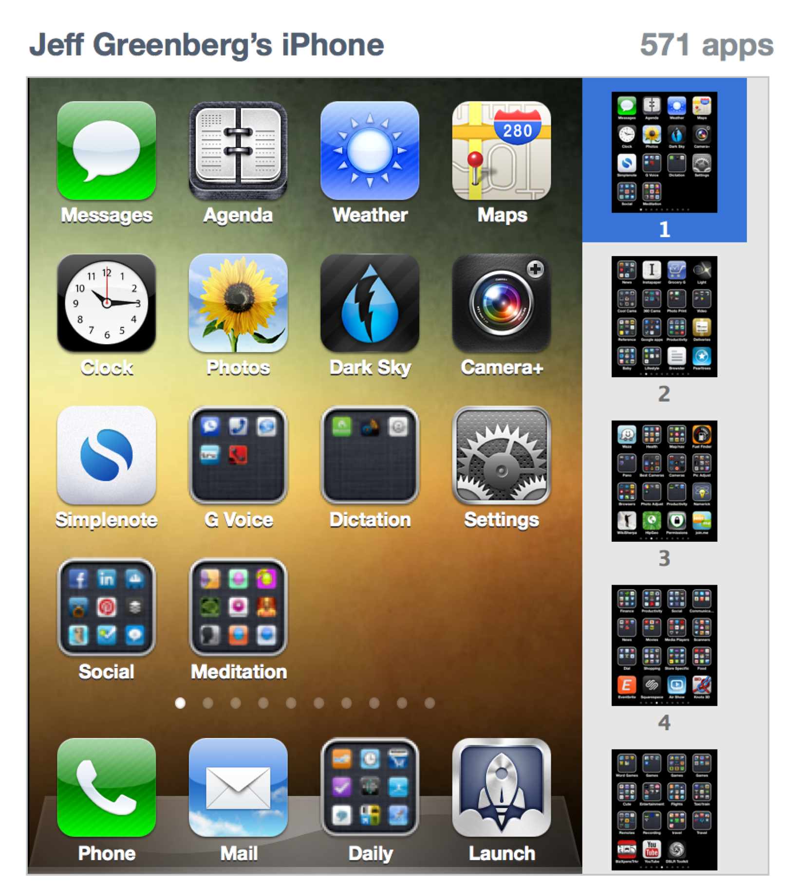
I had some 672 apps on my iPhone. That's far, far too many. Even 571 is too many.
So I did a quick run through and removed 20% of my apps.
Some things to share:
- iTunes really blows in trying to figure out what a specific app does. Trying to do it from the organization screen is impossible. Doing so in other areas of iTunes is a pain (probably a scathing post later about this)
- First 2 pages 'Important'. Obvious stuff like games are further back.
- How is it that I have 6 groups full of cameras?
- I find a low level resentment for brickspace retailers that I need their app to get a discount. Needless to say, anything push based from them is disabled.
I find the 'back pages" are full of stuff that I think I might need "in a situation" - sorta a swiss army knife app. There were/are still too many damn apps that I have no idea what they do; I'm going to have to go back and check them and write about the experience.
Three email tips/Do you really have to send that email?
I love the flowchart from here : OnlineITDegree.net TL;DR? Basically, we're drowning in email. 20+ hrs a week worth. That halves your efficiency, and it's brutal as a 'creative.'
Most of the people I know (including you if you read this) already are aware that email is killing us all.
There were three good things that I want to mention from it (one that I already do.)
- NNTR - No Need to Respond. In the Subject line.
- EOM - End of Message. Again, write your subject with EOM
- 3 sentence rule (which I'm going to amend as the 5 sentence rule , which is how I encountered it first.) Mostly, just see if See if you can keep your email under 5 sentences.
Imagine if everyone adopted these rules!
Just the flowchart alone saved one company 20% of the time.
Please plan your workflow. Please?
I've just come across a friend who is dealing with a workflow problem. The problem is that he switched from one NLE to another...and things don't work the same.
I'm not calling out the person; I'm not calling out the editorial tools....I understand that he has an investment in hardware and software (including cameras.)
But why, why not first, contact the NLE manufacturer or resller and say "How to best do this?"
Get the download demo, walk thorugh head to tales what your workflow plans to be.
Realistically, that's what whiteppapers are for, right? But the day of one format (like one NLE) is pretty much a myth. It's always a mixture of formats (and frame rates, and compression types.)
More on the Retina display...
From the Engadget review "The primary Apple apps -- Safari, Mail, the address book, etc. -- have all been tweaked to make use of all these wonderful pixels. Sadly, little else has. While we got assurances that third-party apps like Adobe Photoshop and AutoCAD are in the process of being refined, right now, seemingly every third-party app on the Mac looks terrible."
MacBook Pro Retina Display - interesting choices
If you are an Apple Fan, you saw the announcements yesterday.
For me personally, the big question was about the new MacBook Pro. I'm overdue by about a year (last time was 2009, and I swore, I'd buy and dump after a year...and forgot...and forgot.) Also, my wife is overdue for a system as well.
The new Retina display has to be my new machine. I need a system that has a great (read HD) display, I need an SSD (less moving parts) and it has to have thunderbolt.
On the great side, the new MBP is thinner (yay!) and has USB 3.0 (a sore spot from Apple, especiaily on the MacPro line.)
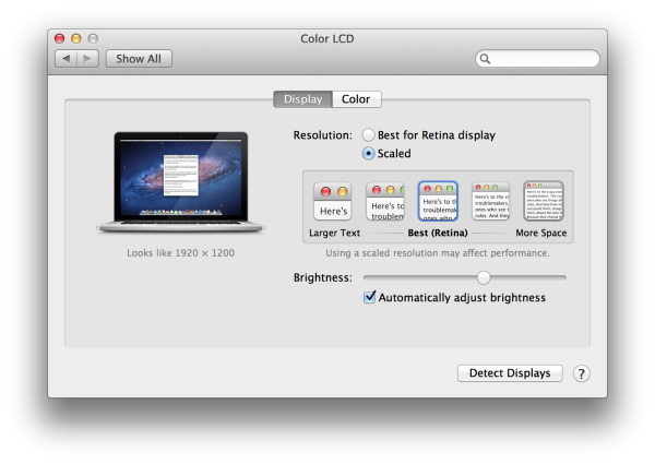
I was wondering in this blog post exactly how they'd handle the problem of a denser display without the ability to increase the font size. Since 10.7 doesn't have an independent resolution and doesn't permit customizations, all I would see is small fonts. Or, should I say, wouldn't see, because it'd be too dense.
It looks like Apple is taking a page out of the iPad - they're doubling the resolution from 1440x900 to 2880 x 1800.

From what I've read, Apple is rendering the screen twice. It's got some scaled resolutions, such as 1440x900 and 1680x1050.
This will be a nightmare at the 'Retina' resolution, for Applications that are mired in old code. I'm dying to work at actually 1920x1080 or above, since I work with video, and my struggle is going to be the problem of seeing text in those apps.
Apple's perspective, is likely, if they don't follow our rules, screw them. Or work at a smaller resolution. I'm terrifically curious - for years (5 or so), There's been the claim that Apple is going to have resolution independence - fonts/menus/etc could be the same regardess of the resolution. Each iteration of the OS, it's mentioned as a beta feature and then disappears.
I have a couple of apps that I'm really worried of how OSX will render them. Avid Media Composer is my #1 worry - but I'll be curious how fixed font sizes look in some of the other apps.
Adobe Roadshow hits DC
On Monday, I was speaking at the Adobe CS6 Roadshow in DC.
This is a great event; when it does come to your city, it's worth attending (there are loads of upcoming cities!)
In NYC, DC and LA, there are also special training seminars.
These are perfect for an editor who sees the Adobe Production Suite (Premiere Pro, Adobe After Effects, Speedgrade) in their near future.
Here are the presentations I gave, as promised.
Broadcast centered editing.pdf- this is about adopting Premiere Pro and understanding some of it's feature set that apply to a broadcast environment.
Editing faster.pdf- a crash course in editorial in Premiere Pro.
Trimming.pdf- Trimming, the adjustment of clip length in the timeline - something that I feel makes and breaks and editorial system (and editor) demystified.
If you're going to join us in LA - drop me a line - I might be able to arrange a special present.
The problem with a Retina Screen
How am I going to be able to read anything?
Like everyone else, I've been holding off (too long) on getting a new mac. I 'needed' one in October - and for the first time I paid attention to the rumor mills in my life - new MacBookPros would be out any day.
No great prognostication here: At WWDC that Apple will announce a bunch of updates, including to the MacBook Pro. Will it be a MacBook Pro Air? I have no idea. That's too many words for a product name.I hope they get rid of the whole 'air' idea and just have two models of super skinny laptops.
One big rumor right now- a retina screen
Great. I need more pixels and sharper ones. Make it so I can't see the dots.
But the Mac OS is broken in a simple way.
The Font/UI cannot be scaled.
There's been rumors for years, for more than one iteration of OSX, that the Menus will be adjustable. That'd also mean window title size, contextual menus, etc.
Take a quick look at this article from Macintouch - just skip right to the part on Resolution independence.
Bunches of software I use have some custom or tiny UI/text elements. One piece of software has a palette with text that was designed when the mac had 640x480 screens. That palette? Not so readable now. And it'll be nearly impossible to read under a retina display.
I have a feeling that if retina displays come out, Apple will have a 10.7.5 release that will double UI widgets, until Mountain Lion comes along and (hopefully) we'll have a litlte more scalability.
Adobe RoadShow hits NYC
On Tues, I was speaking at the Adobe CS6 Roadshow. This is a great event when it does come to your city; but in NYC, DC and LA, there are special training seminars. These are perfect for an editor who sees the Adobe Production Suite (Premiere Pro, Adobe After Effects, Speedgrade) in their near future.
I'll need to update these for the next city, but here were the presentations, as promised.
Broadcast centered editing.pdf - this is about adopting Premiere Pro and understanding some of it's feature set that apply to a broadcast environment.
Editing faster.pdf - a crash course in editorial in Premiere Pro.
Trimming.pdf - Trimming, the adjustment of clip length in the timeline - something that I feel makes and breaks and editorial system (and editor) demystified.
I'm not a master of wordpress
But I am trying to figure out all the pieces of how it works. It is the defacto blogging platform at this point. I did (once upon a time):
- Manual HTML
- Claris Homepage
- Aldus Pagemill
- Dreamweaver
- Movable Type- 03
- TypePad - 05
I'm done with code, y'know?


